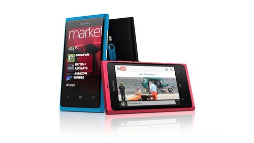
Nokia Lumia 800 review, originally uploaded by benaston.
Although in the pre-smart phone era, I’d always loved my Nokia phones, I’d become a bit disenchanted with them and was pretty firmly attached to my Android HTC Desire on Android. But seeing as Nokia gave me one of their shiny new Windows 7 phones, the Nokia Lumia 800, I thought I’d give them another try.
Nokia Lumia 800 – what’s good?
So after a month long road test, what’s good about the Nokia Lumia 800? From the outside, it’s pretty. In your hand it feels as solid as an old school 6310 – it’s got a cool curved with a unibody design – carved out of a single polycarbonate shell (so even when it’s scratched it’ll retain its colour). It feels robust, like you could drop it and it’d still work. What’s more, it’s got Gorilla Glass which means is lightweight, and highly damage-resistant meaning you don’t have to stick any of those stupid screen protectors on your phone to keep it looking shiny and new.
And it’s pretty on the inside too. If you’re at all familiar with the Microsoft Windows 8 or Zune interfaces, you’ll immediately feel at home. The interactive experience is based around sliding screens which allows for lots of white space in design – it all looks very sleek compared to the Android platform and a lot more interesting than iOS. The boundaries between content and apps and contacts are blurred too, with the ability to ‘pin’ anything you want quick access to on your homescreen. Whether it’s a favourite picture, e-ticket or contact, you just pin it on the screen so it’s quick and easy to access.
From a user’s perspective, integration is great across your social and messaging platforms: messages and communication are centred around your contacts and groups of people, rather than through a specific programme. The Windows Mobile platform aggregates your messages, feeds and updates for you, so that you don’t have to delve into all your different apps to stay updated.
What’s more, Nokia have thrown in some good software too – their Nokia Drive app allows you to download maps of the entire planet to your phone, so that you don’t have to use data on the go, giving you sat nav wherever you are. And the Windows Skydrive gives you 25gb of cloud based free storage, so you can access all your important stuff on the move. You’ll find all the big apps that you’ll want have got Windows Mobile versions too – Spotify, Twitter, Facebook, Evernote, Trip Advisor and yes, Angry Birds – it’s all there and it looks a lot prettier than it does on Android or iOS.
So what’s not so good? From an aesthetic design perspective, it’s all good – no complaints on that at all. But I’m not sure about the lack of certain features. In terms of storage, 16gb is good, as is a 25gb SkyDrive, but I’m not sure that it makes up for the lack of micro SD slot – it’s a major omission that reduces its ability to be your primary music playing device. And one thing I’ll miss on the Nokia Lumia 800 is the ability to swap batteries in and out when you’re running low on juice.
Nokia Lumia 800 – what’s bad?
On the inside, I’m not convinced about the Windows 8 homescreen tile design; it’s too restrictive, it seems they’ve elevated form too far above function. I can see how it would be great on a desktop or tablet, but on a phone, the tiles (and the persistent clock) take up too much real estate; you find yourself having to do a lot of scrolling. The same goes for viewing all your apps, you have to do a lot of scrolling to get to the bottom of your alphabetically ordered apps; there’s no way to reorder them. Annoying.
I was also hoping for a bit more from the camera, with a Carl Zeiss lens, I was expecting some really sweet pictures – they’re ok, but just a bit average, especially when using the video camera. Hopefully though, with the almost weekly firmware updates this will soon get started. My final niggle is with the lack of Google integration – MSN, Facbook, Twitter etc are all integrated beautifully, but you can’t help but feel that they could have tried a bit harder by allowing Google Maps (and Latitude) and Flickr integration into the platform; those things work, it’s just all a bit awkward.
Verdict – Nokia Lumia 800
This is a good phone though, I like it. It feels like a significantly different from Android or iOS. From a software perspective, it’s got a bit of a way to go but with Nokia’s incessant software updates, I think this is going to get better and better. This is definitely more than just an also-ran platform, the Nokia Lumia 800 is in the major league.
7.5/10

Thank you, it sounds good. I have always stayed well clear of anything to do with MS. I will give it a look.
You mentioned the persistent clock takes up too much space. What persistent clock? Mine is just a tiny clock on the right top corner. I wish they could be bigger. You did not mention about the quality of the music. My Lumia 800 music quality sounds terrible compared to my N8. I tried all types of headphones but still sound horrible.
The clock that’s in the top right hand corner, in most, but not all of the apps. I like the fact that you can slide the ‘top clock bar’ down and see the status of the wifi connections but I think it’s a waste off space being permanently there; why not make it like the rest of the top bar, and only make it visible when you slide it down?
Re the music – I’ve not really had any problems with mine, other than a few glitches in songs when using spotify. Have you done all the firmware updates?
Good review, my Lumia 800 is due to arrive tomorrow and I’ve heard how amazing the Twitter/Facebook integration is and the battery issue has also been fixed
Helpful article – thanks. I have just ordered one following boredom with iOS and two failed android relationships. Then I read that you’re over at Christchurch; I am at Revelation in Camden, the newer NF plant… Small world!